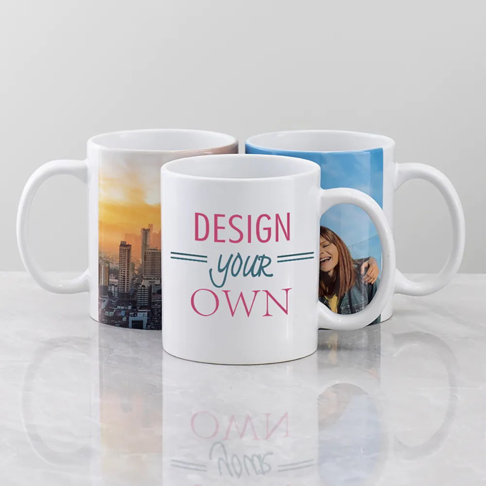
 Custom Mugs
 Custom Shot Glasses
 Custom Water Bottles
 Custom Beer & Wine Glasses
 Custom Tumblers
 Custom Tote Bag
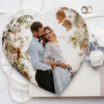 Photo Puzzles
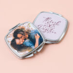 Custom Compact Mirrors
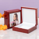 Custom Jewelry Boxes
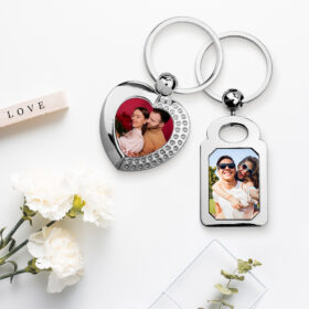 Custom Key Chains & Luggage Tags
 Custom Pet Bowls
 Custom Face Mask
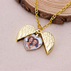 Custom Jewelry Necklaces
 Custom Pillowcases
 Christmas Bags & Stockings
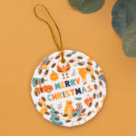 Custom Ornaments
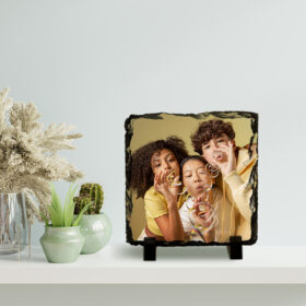 Photo Slates
  Tile Frame
 Custom Cutting Boards
 Custom Plates
 Custom Bottle Openers
 Custom Coasters
 Custom Blanket
 Custom Notebooks
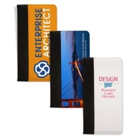 Custom Business Card Album
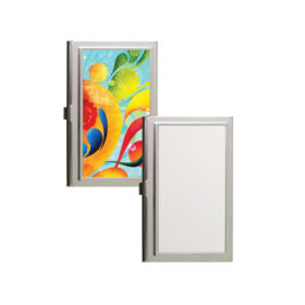 Custom Card Holders
 Custom Pencil Holders
 Power Bank
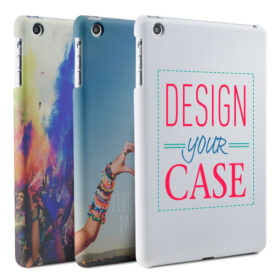 iPad Mini Cases
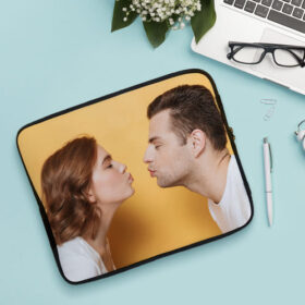 Laptop Sleeves
 Mouse Pads
 Phone Cases
 Custom Products
 Pre-designed Products
Design Tool Tutorial
This tutorial provides an overview of how to utilize the VivoPrint Design Tool. This versatile tool empowers you to personalize various products using photos, illustrations, messages, logos etc. Thanks to VivoPrint, you can easily design your own customized drinkware, accessories, home decor items, electronic accessories, and more! Keep reading to discover how to embark on your design journey.

To begin uploading your photos, start by clicking the “Customize Your Own” button for the product you want to design. Then, navigate to “Image” -> “Upload Image” in the left design panel. Here, you can browse your computer and choose an image for upload. The “Upload Image History” feature conveniently displays all your previously uploaded images, saving you the trouble of re-uploading. Below, you’ll find a list of the available image editing functions:
 Simple Filter: We provide a choice of eight unique filters to enhance your images.
- Align: This feature enables you to align your image either horizontally, centrally, or vertically within the canvas.
- Flip: The Flip tool offers both horizontal and vertical flipping options, simplifying the process of adjusting your image’s orientation.
- Size: You can modify the image size by clicking and dragging any of the handles located at the corners of the image.
- Fill & Fit: Clicking “Fill” will completely fill the canvas with the image, while clicking “Fit” will adjust the image to fit within the canvas.
- Angle: Adjust the rotation angle by dragging the slider, or input your desired angle directly into the text box.
- Opacity: Change the image’s opacity by sliding the opacity control or entering your desired opacity level in the text box.
- Move: To reposition the image, simply use your mouse to drag it to your desired location.
- Delete: If you wish to remove an image, click the red delete button located to the right of the image you want to delete. You can also right click and select delete.
 Simple Filter: We provide a choice of eight unique filters to enhance your images.
 Align: This feature enables you to align your image either horizontally, centrally, or vertically within the canvas.
 Flip: The Flip tool offers both horizontal and vertical flipping options, simplifying the process of adjusting your image’s orientation.
 Fill & Fit: Clicking “Fill” will completely fill the canvas with the image, while clicking “Fit” will adjust the image to fit within the canvas.
 Angle: Adjust the rotation angle by dragging the slider, or input your desired angle directly into the text box.
 Opacity: Change the image’s opacity by sliding the opacity control or entering your desired opacity level in the text box.
Text
To add text, select “Text -> Add Text” in the left design panel. Enter your desired text in the input field then click ok to apply (character limit is based on design). Listed below are the text edit functions:
- Align: This feature allows you to align your text either horizontally, centrally, or vertically within the canvas.
- Flip: The Flip tool offers both horizontal and vertical flipping options, simplifying the adjustment of your text’s orientation.
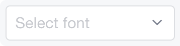
- Font: Utilize the drop-down menu to select the text font of your choice.
- Size: You can resize the text by clicking and dragging any handle on the textbox’s corners. Alternatively, you can input your desired text size.
- Justification: Adjust the text’s alignment, choosing between left-aligned, centered, or right-aligned.
- Spacing: Modify letter spacing by sliding the spacing control.
- Color: Select the desired text color using the color palette and click “OK” to confirm your choice.
- Background: Choose the text background color from the color palette and click “OK.” You can also use the “Clear” option to remove any background color.
- Angle: Alter the rotation angle by dragging the slider, or input your preferred angle directly into the text box.
- Opacity: Change the text’s opacity by sliding the opacity control, or specify your desired opacity level in the text box.
- Move: Reposition the text box by using your mouse to drag it to the desired location.
- Delete: To remove a text box, click the red delete button located on the right side of the text box you wish to delete. You can also right click and select delete.
 Font: Utilize the drop-down menu to select the text font of your choice.
 Size: You can resize the text by clicking and dragging any handle on the textbox’s corners. Alternatively, you can input your desired text size.
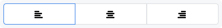 Justification: Adjust the text’s alignment, choosing between left-aligned, centered, or right-aligned.
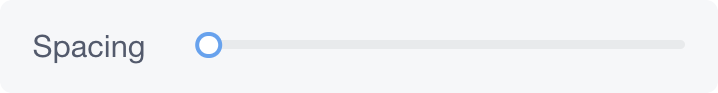 Spacing: Modify letter spacing by sliding the spacing control.
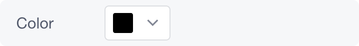 Color: Select the desired text color using the color palette and click “OK” to confirm your choice.
 Background: Choose the text background color from the color palette and click “OK.” You can also use the “Clear” option to remove any background color.
Layers
In the layer section, you can view all the images and text you’ve uploaded. You have the flexibility to rearrange these layers. For instance, if you initially input a textbox and later upload an image, you can access the Layers menu to ensure that the text box is positioned above the image, allowing it to appear on top of your image.
You can also manage layers by right-clicking on the image or text you wish to modify. Choose the “Layer” option from the menu that appears, and from there, you can alter the layer’s stacking order.

Background
The Background feature enables you to incorporate a background color into your design, and it is particularly useful for color mugs. You can choose a color that complements your mugs for a more cohesive look. Simply click the plus button to select your preferred color, and we have also provided a list of popular background colors for your convenience.

Gallery
The Gallery is a recently introduced yet highly sought-after feature. You can easily find specific images by entering keywords into the search box. With numerous images available in the search results, you can select the one that best suits your preferences. Please note that you can select a maximum of four images per one product.

Products
The products section offers you product information and detailed description. Additionally, on the right-hand side, you can view the product in other available colors. By clicking on any of these colors, you can easily switch and preview how your design will appear on a different color variant.
Preview Your Design
To preview your design, simply click the preview window located in the bottom-right corner. You also have the option to download this preview. When you’re satisfied with your design, click the “Add to Cart” button situated in the upper right corner to include it in your shopping cart. Prior to finalizing your purchase, we kindly ask that you thoroughly review all the designs within your shopping cart before purchasing.
If you have any further inquiries or require assistance, please don’t hesitate to reach out to our customer support team at (877) 836 – 5992, or you can get in touch with us through our contact form.